As you may know already, CSS3 has introduced a new set of properties which allows you to easily add curved corners to a box.
Simple round corners
You can create a div with round corners with this simple css:
div {
    border-radius: 50px;
}

However, given the stage of development CSS3 is at as of now this is only supported by Google Chrome… Instead, you are encouraged to add vendor prefixes :
div {
    -webkit-border-radius: 50px; /* for Chrome */
    -moz-border-radius: 50px; /* for Firefox */
}
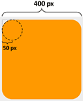
How much of a curve the corners get is worked out by placing an imaginary circle of a radius of the given number of pixels at each of the corners (see image below):

Naturally this introduces an interesting edge condition – what if the radius of the imaginary circles is set to be equal to or greater than half of the width of a square-shaped element? Do we just get a circle back?
Yes.

Specify different radius for each corner
You can specify a different radius for each of the top-left, top-right, bottom-right and bottom-left corners either like this:
div {
    /* for Chrome */
    -webkit-border-top-left-radius: 40px;
    -webkit-border-top-right-radius: 10px;
    -webkit-border-bottom-right-radius: 80px;
    -webkit-border-bottom-left-radius: 20px;

    /* for Firefox */
    -moz-border-radius-topleft: 40px;
    -moz-border-radius-topright: 10px;
    -moz-border-radius-bottomright: 80px;
    -moz-border-radius-bottomleft: 20px;
}
Note: the property names are different!
Or using the short-hand syntax by listing 4 consecutive values for each of the four corners in the above mentioned order:
div {
    -webkit-border-radius: 40px 10px 80px 20px;  /* for Chrome */
    -moz-border-radius: 40px 10px 80px 20px;  /* for Firefox */
}
both will produce the same result:

Oval-shaped corners
You don’t have to be content with circular-shaped corners either, to specify an oval-shaped corner, just use this syntax:
div {
    -webkit-border-radius: 80px / 40px;  /* for Chrome */
    -moz-border-radius: 80px / 40px;  /* for Firefox */
}

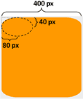
The only thing we’re doing differently now is that we’re putting an oval as opposed to a perfect circle into the corners. The oval is defined by a width and height:

And once more, you can specify these for each corner by setting separate properties:
div {
    /* for Chrome */
    -webkit-border-top-left-radius: 80px 40px;
    -webkit-border-top-right-radius: 10px 50px;
    -webkit-border-bottom-right-radius: 40px 80px;
    -webkit-border-bottom-left-radius: 60px 20px;

    /* for Firefox */
    -moz-border-radius-topleft: 80px 40px;
    -moz-border-radius-topright: 10px 50px;
    -moz-border-radius-bottomright: 40px 80px;
    -moz-border-radius-bottomleft: 60px 20px;
}

though unfortunately there’s no short-hand syntax to save you from all these typing this time around.
And finally, you don’t HAVE to use pixels as unit either, most other standard CSS units work too. It’s also worth noting that using the vendor prefix (e.g. -webkit, -moz) allows for a more graceful degrading behavior IF the final spec for CSS3 uses a different naming scheme for the border radius properties.
Demo
Check out this quick demo page I’ve put together for you to see the effect of changing the border radius, note this only works if your browser supports the new ‘range’ input type defined in HTML5 (Chrome works fine, but Firefox doesn’t support it yet).
Liked this article? Support me on Patreon and get direct help from me via a private Slack channel or 1-2-1 mentoring.

Hi, my name is Yan Cui. I’m an AWS Serverless Hero and the author of Production-Ready Serverless. I specialise in rapidly transitioning teams to serverless and building production-ready services on AWS.
Are you struggling with serverless or need guidance on best practices? Do you want someone to review your architecture and help you avoid costly mistakes down the line? Whatever the case, I’m here to help.
The post Having fun with CSS3 – Border Radius appeared first on theburningmonk.com.
